Exploring React useContext Hook
The useContext hook is a built-in React hook that facilitates the sharing of data between components without relying on props to pass the data down the component tree. It allows components to access a context object created by the createContext function, which acts as a global data store accessible to any component within its scope.
1. Advantages of the useContext Hook
- Eliminates Prop Drilling: Prop drilling, the process of passing props through intermediate components, can be tedious and error-prone. With the
useContexthook, you can directly access the required data from the context without explicitly passing it as a prop. - Simplifies State Management: By leveraging the
useContexthook, you can centralize and manage states at a higher level, making it easier to update and share data across multiple components. - Reduces Component Coupling: Components using the
useContexthook are not tightly coupled to the component that provides the context. This decoupling improves code maintainability and reusability.
2. Using useContext to Manage Theme
Let’s dive into a simple example to illustrate the usage of the useContext hook for managing a theme across multiple components.
Step 1: Create a Context
import { createContext } from "react";

const ThemeContext = createContext();

export default ThemeContext;
Here, we have created a new context using the createContext function provided by React. The createContext function returns an object with two properties: Provider and Consumer. Here, we store the context object in ThemeContext and export it for later use.
Step 2: Create a Provider
import React, { useState } from "react";
import ThemeContext from "./ThemeContext";

const ThemeProvider = ({ children }) => {
  const [theme, setTheme] = useState("light");

  const toggleTheme = () => {
    setTheme((prevTheme) => (prevTheme === "light" ? "dark" : "light"));
  };

  return (
    <ThemeContext.Provider value={{ theme, toggleTheme }}>
      {children}
    </ThemeContext.Provider>
  );
};

export default ThemeProvider;
Here, we have defined a component called ThemeProvider. It receives a children prop, which represents the nested components that will be wrapped by this provider.
Within the ThemeProvider, we use the useState hook to create a theme state variable, initialized with the value "light". We also define a toggleTheme function that toggles the theme between “light” and “dark” based on the previous theme value.
The ThemeProvider component wraps the children components with the ThemeContext.Provider component. The value prop of the provider is an object containing the theme state and the toggleTheme function. This object will be accessible to any component that consumes this context.
Similar Posts:
Step 3: Consume the Context
import React, { useContext } from "react";
import ThemeContext from "./ThemeContext";

const Button = () => {
  const { theme, toggleTheme } = useContext(ThemeContext);

  return (
    <button
      onClick={toggleTheme}
      style={{ background: theme === "light" ? "#fff" : "#000", color: theme === "light" ? "#000" : "#fff" }}
    >
      Toggle Theme
    </button>
  );
};

export default Button;
In this code block, we have a component called Button. We import the useContext hook from React to consume the ThemeContext we created earlier.
By calling useContext(ThemeContext), we retrieve the theme and toggleTheme values from the context. This allows the Button component to access the current theme and the function to toggle it.
The Button component renders a button element with an onClick event handler set to the toggleTheme function. The button’s background and text color are determined by the current theme value.
Step 4: Implement the Provider and Consumers
import React from "react";
import ThemeProvider from "./ThemeProvider";
import Button from "./Button";

const App = () => {
  return (
    <ThemeProvider>
      <Button />
      {/* Other components that consume the theme */}
    </ThemeProvider>
  );
};

export default App;
The main component App, which serves as the entry point of our application. We import the ThemeProvider component and the Button component.
Within the App component, we wrap the ThemeProvider around the Button component. This ensures that the Button component and any other components nested inside ThemeProvider have access to the theme context.
You can add more components that need to consume the theme context within the ThemeProvider wrapper.
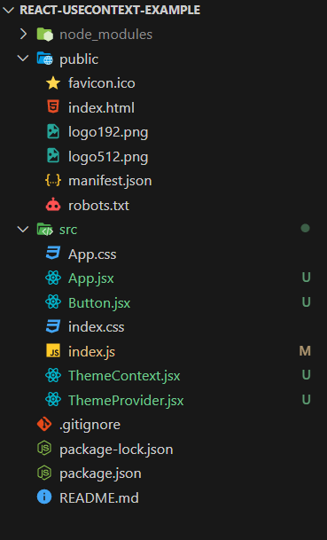
3. Project Structure
The project structure of the code used in the above example.

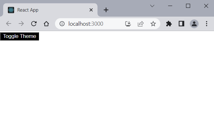
4. Output
Run the app and hit http://localhost:3000/ URL on your browser and toggle the Toggle Theme button.
